Women in the autoimmune community face a number of challenges in day to
day life. Whether the cause is daily symptoms, a self-care routine, or just receiving a diagnosis,
women are disproportionately affected by these conditions by an alarming rate. The time alone that
it can take women to even receive a diagnosis is staggering, with the current average being around
4.5 years, so it’s not surprising that there are a number of women who face challenges in managing
their day to day. This is especially true when there are limited resources and information available
to those in these positions.
Your Daily is a wellness platform with the goal of empowering women in these spaces and giving them
the freedom to experience remission of whatever condition they are currently battling. While the
application has helped countless women experience this freedom, it sometimes struggles to maintain
consistent user activity, resulting in users not sticking to a plan that will ultimately provide
them the tools that they need. With this information we set out to improve the stagnant feel of the
app and provide a more immersive and enjoyable experience.
Working in a team of three with my partners Alexandria Jones and Andrew Tyacke, my role consisted primarily of UX Research, Prototyping, Usability Testing and Project Management.
3-Week Design Sprint
The Current experience of the Your Daily platform exists as a web application. The app
provides a lot of coaching, lessons and exercises that aid in people experiencing remission of their
conditions. Based on prior research as well as our own, these tools have proven themselves to be helpful
for a number of people, the app just wasn’t giving users a rewarding or engaging experience.
With no meaningful way for users to track their current progress or symptoms, users found the experience
to be dry and boring.


A lengthy current onboarding process has also seen a user bounce rate of around 32%,
with direct feedback from users stating that the application was asking for too much information up
front and that users just wanted to experience what it had to offer first.
At the present, there also currently isn’t an option to set personal daily goals, which is something
users had stated they would be motivated by.
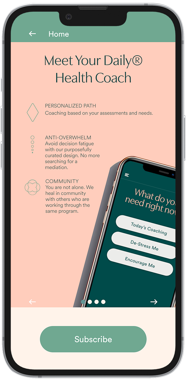
With the motto of “Less is More”, Your Daily seeks to provide help to people without overwhelming them. This
presents itself as a handful of smaller user interactions or bite-sized bits of information, rather than a
lengthy and overly analytical breakdown of every piece.
The challenge was to add functionality to Your Daily in the form of small features that are easy to
understand. We needed to create small tasks for the user that act as building blocks for larger goals.
To do this, we took a deep dive into analyzing prior user research and began to do some of our own.
The focus of our research began with discovering what inspired users to manage a self-care routine. We felt that this paired with their prior experiences interacting with health and wellness applications would give us insight to what made users come back to these apps over and over again. We included users unfamiliar with the Your Daily app as well users who had been interacting with the platform consistently.
Who are the people most likely to interact with health and wellness apps?
Why do people enjoy their experience interacting with them?
What makes them feel motivated and like they are making progress on their remission while also being able to manage a self-care routine?
How can people better utilize these tools to manage their day to day symptoms?
We sought to interview women who had regularly interacted with other health and wellness applications as well as current users of the Your Daily platform.
“If you self-reflect often, you can pivot and adapt to make the necessary changes in your life.”
- a health and wellness app user
Users want to feel like they have a custom plan tailored to their own needs.
Users want to feel like they are working towards their own specific goals, instead of those defined by others.

Users want to be able to effectively track their daily metrics in their own health journey.
Our goal is to create an experience that is both easy to use and comprehensive in its ability to set goals, achieve them and track a user's progress. This can be done by collecting a user’s health metrics in a visually friendly way. By collecting this data, we can then customize a user’s daily content schedule and offer them informative solutions based on how they are currently feeling.


With a better understanding of what our users goals and needs were, we looked prospectively at some possible
paths they might take through the Your Daily app. This was crucial to us discovering what to focus our
efforts on as far as feature development.
With Jennifer being a busy business owner and previously achieving remission of her condition, she sometimes
feels like she has a never ending to-do list. Her focus stems more from being able to keep herself in
remission and make progress on her overall health and wellbeing. Her experience is highlighted in her
ability to keep a schedule and track her progress.
Hannah on the other hand has been newly diagnosed with an autoimmune condition. She feels like she needs to learn more about how to manage her symptoms and is turning to Your Daily as a new user. She isn’t sure how she will enjoy the platform yet, so she proceeds to test it out before making a subscription.

These maps helped us to pinpoint which features users from our research would most focus on. It was clear to us from our data that the main emphasis was on creating goals and effectively on a day to day basis, while being able to analyze overall trends.

With a majority of our users stating that they liked being able to visually track their progress in other
health and wellness apps and highlighting the specific features that kept them coming back, we began to
ideate on a few solutions.
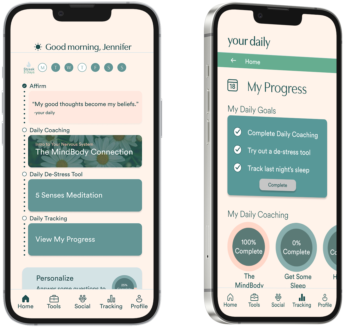
In Jennifer’s case, we can begin to track how she’s feeling day to day with a simple daily check-in. We can
ask her how her mood is, how many hours of sleep she got the night before and how many bowel movements she
had in the previous day. This can then be used in a tracking section further into the app so she can monitor
her progress and overall condition over time.

A primary mood selection followed by a few secondary mood choices Allows users to track their mood over time and receive recommendations on any given day.

A sleep quality and bowel movement check-in adds important metrics to the health tracking portion of Your Daily allowing users to monitor their progress over time.
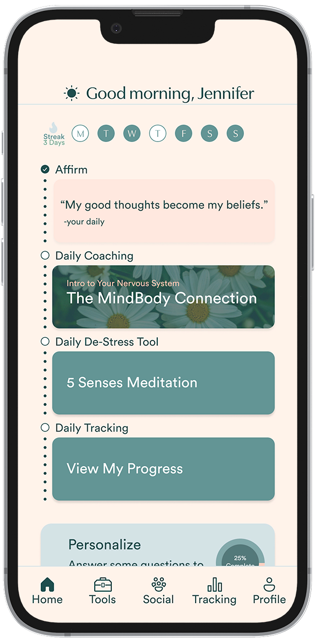
A home screen with a timeline view full of recommended tools a user can try each day with the ability to further customize their experience by taking part in more assessments.
Comprehensive tracking with the ability to check off a daily goal list, track current lesson progress, and monitor various metrics over time.
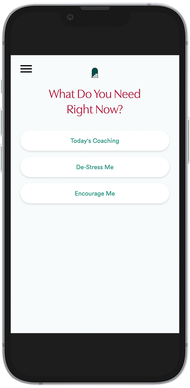
With a number of our users not wanting to enter a lot of their personal data or spending money before trying
out an application, it can be a detracting experience if that is the only option presented to them.
By stage gating certain portions of the app and allowing users to access some of the basic elements of how
Your Daily works as a guest, they can assess if the platform is truly a good fit for them and their needs.
Once they have determined it is what they are looking for they can then choose to open a subscription. We
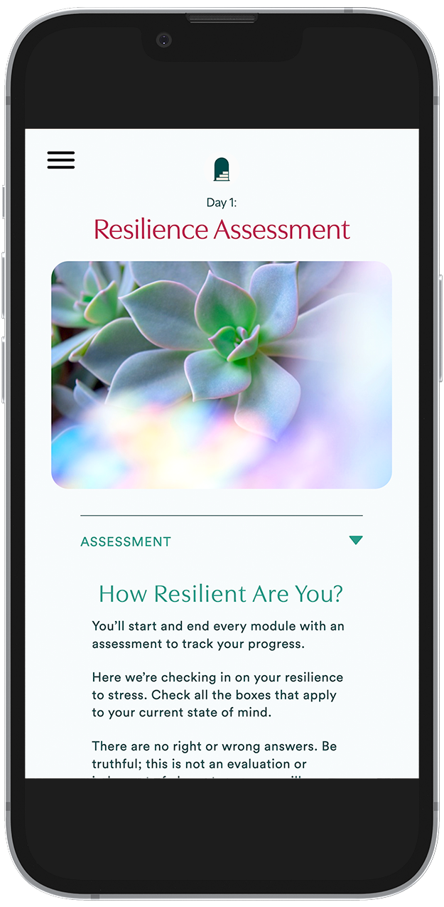
can also limit the number of initial assessment questions so the user can quickly get into the action.
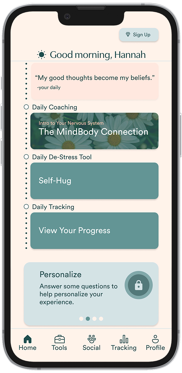
Guest users are given a lot of the same functionality as subscribers, however with a few key features being unavailable to them.
Locking features such as extended personalization and further coaching, the user can decide if this is the right choice for them and subscribe any time.

Reducing the initial health questionnaire from the original 32 questions to just 2 allows users to jump right into what the platform is all about.

The second question acts as a clarifying question to further personalize the user’s experience by recommending them daily personal tools.
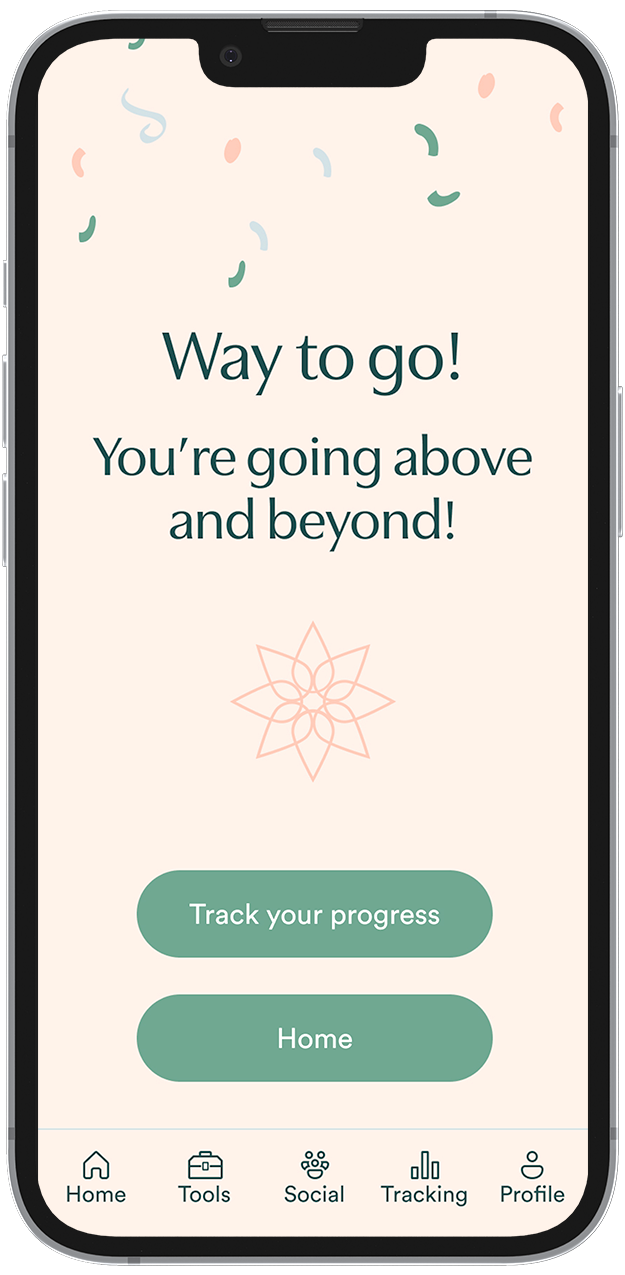
Alongside the small victories, users are celebrated for completion of daily activities.
Every feature of the design allows users to take in bite sized pieces of information with achievable small goals without overwhelming them.
Over a series of 4 moderated usability tests, we gave users a set of 2 tasks based on both of our personas
task flows. While the overall completion rate of the first task was 100%, the second one resulted in a 0%
completion rate. From our post usability test interviews, we discovered that users could not determine that
the “Premium” button allowed users to subscribe to the service. We were able to iterate on this and a few
other features once analysis was complete.
Furthermore, we conducted a short survey alongside our interviews to generate an average SUS score. This was
ranked at an average of 73 indicating that the system usability was slightly above average, with room for
improvement.
Relabeling the “Premium” button to read “Sign Up” makes the function more clear.

Making the daily goal list checkable makes users feel more accomplished. Adding specific hours to the sleep check-in made what users were logging more clear.