As a local brick and mortar store selling boutique music equipment in
Seattle, Washington, The Trading Musician has served as a hub for the local music community since
1991. From offering instrument sales, lessons, band and orchestral rentals and repairs it has become
a one stop shop for the arts in a city with a very rich musical history. While its in-person
experience has a charming and welcoming feel, its online platform struggles to meet the same
expectations.
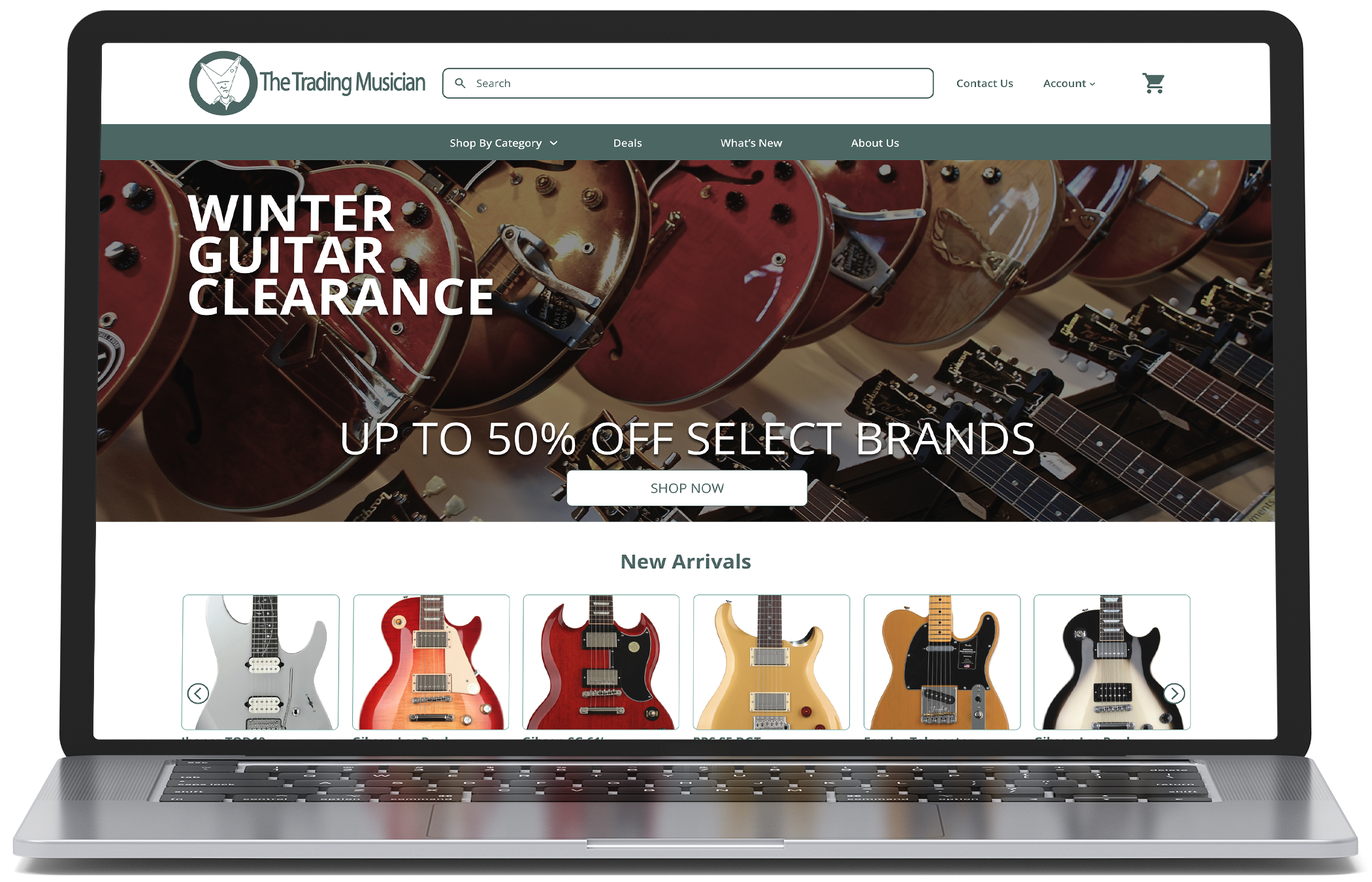
To bring the company’s current offering into a more modern feel while also enriching the experience
with a set of tools that enables shoppers to find exactly what they need, I have redesigned The
Trading Musician’s website to have a completely new look and feel while keeping up with their
classic image and branding.
2-Week Design Sprint
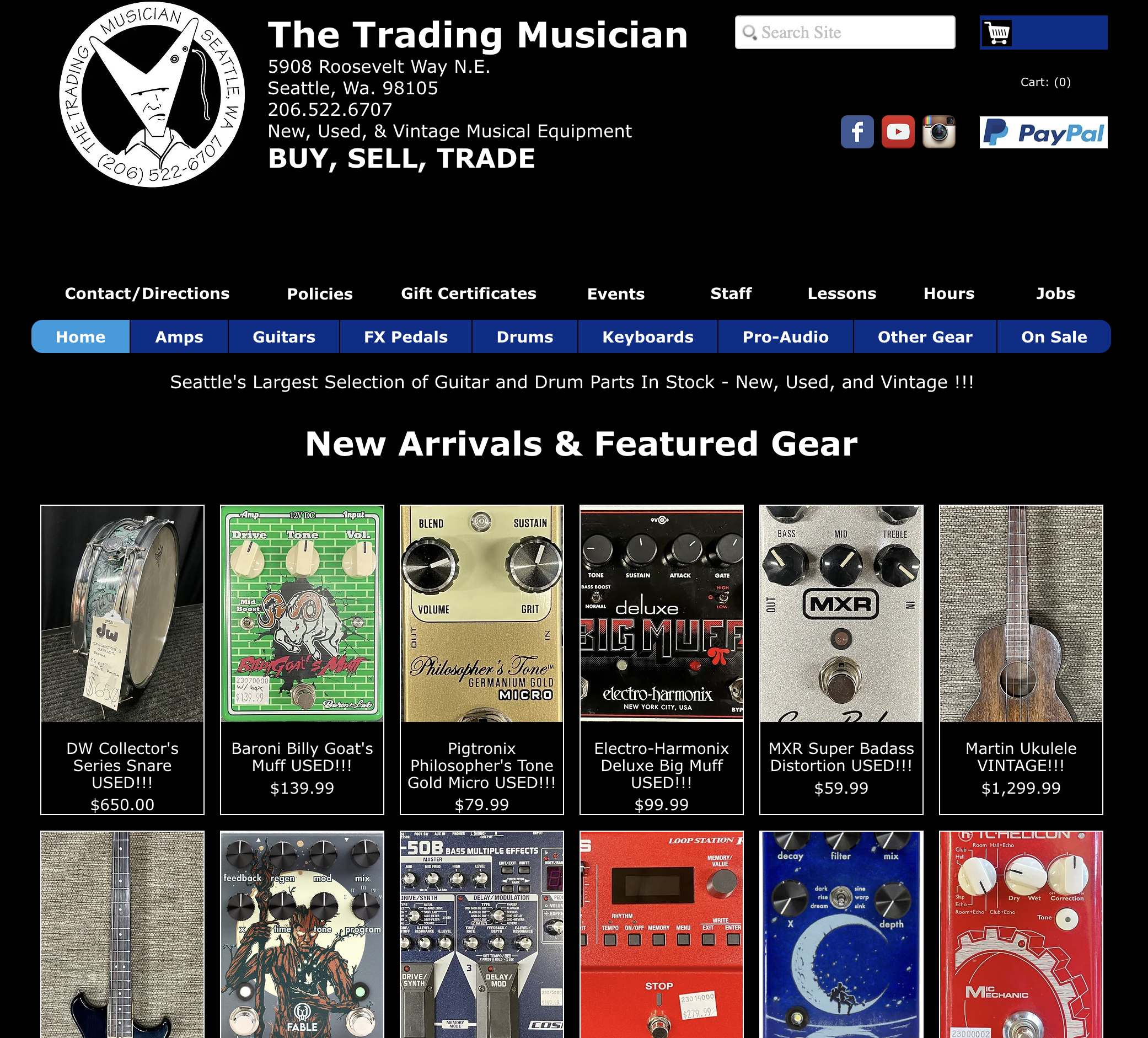
While the current Trading Musician website has a nostalgic web 1.0 feel, it suffers from a lack of
organization. With product listings seemingly placed at random points throughout the page and with no useful
way to sort them, it can be difficult for the user to find the product they are looking for.
This issue is also combined with a complicated navigation bar that provides so many options that it can be
hard to focus on just one.
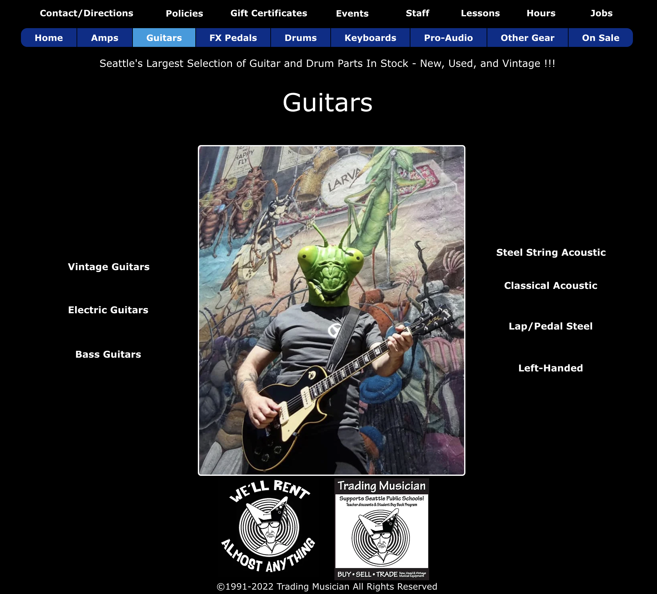
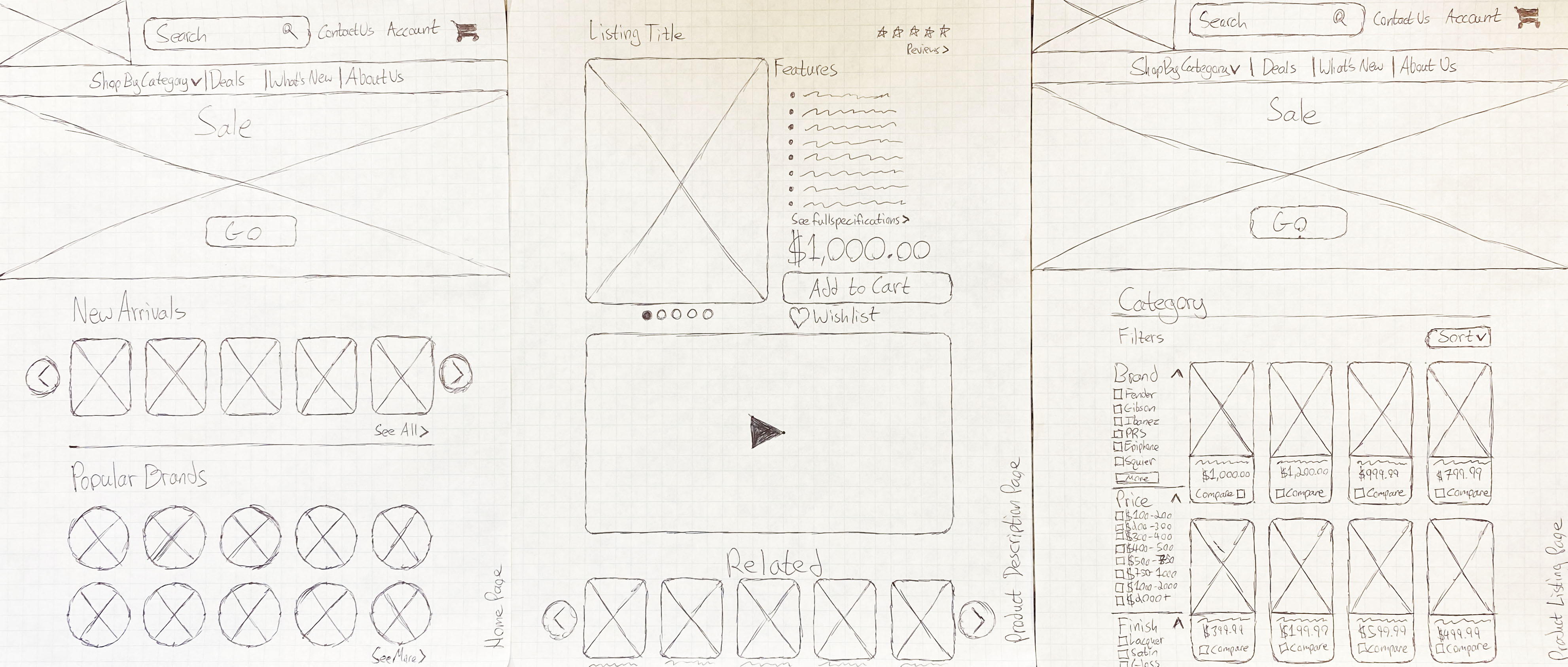
On a similar note of navigation, if one visits the general product listing page for any category, they are
greeted by a centered image with navigation links arranged in a circle surrounding it. This can make it
difficult for the user to narrow down what specific category they are looking for.
The lack of a useful search tool and sorting options for product listing pages leaves the user to endlessly
scroll through a long list of products in any category they decide to view.
The current layout of TradingMusician.com creates a troubling experience in purchasing music equipment
online. While the main factor is a lack of organization, there are numerous other issues ranging from lack
of general product information, to a checkout process that feels untrustworthy.
My task was to design an experience that is approachable and organized, while instilling a sense of trust
with the user that they are getting the products they really want. How did I start? With interviewing local
musicians.
My primary objective in my user research was to determine what features users liked most about other online music equipment retailers they interacted with regularly. From there I wanted to discover how often they were using these platforms and what their intentionality was behind their frequency of use. This ranged from users who made purchases from their favorite sites only a few times a year, to users who were browsing almost daily and adding items to their wishlists.
Who are the people most likely to interact with a boutique music equipment retailer?
Why do people enjoy their experience interacting with them?
What makes them come back to an online retailer repeatedly and sometimes almost daily?
How can users effectively find what they’re looking for while feeling informed on their purchases?
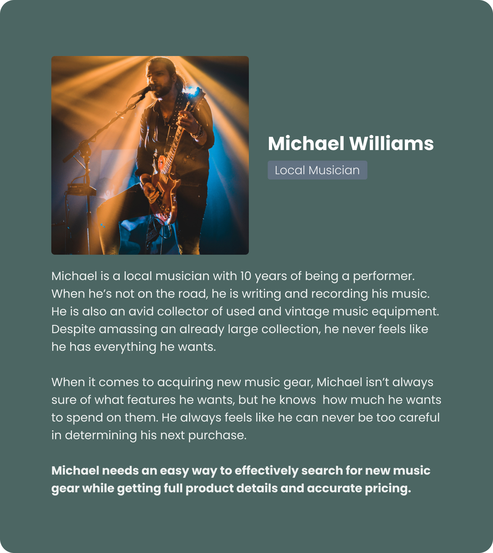
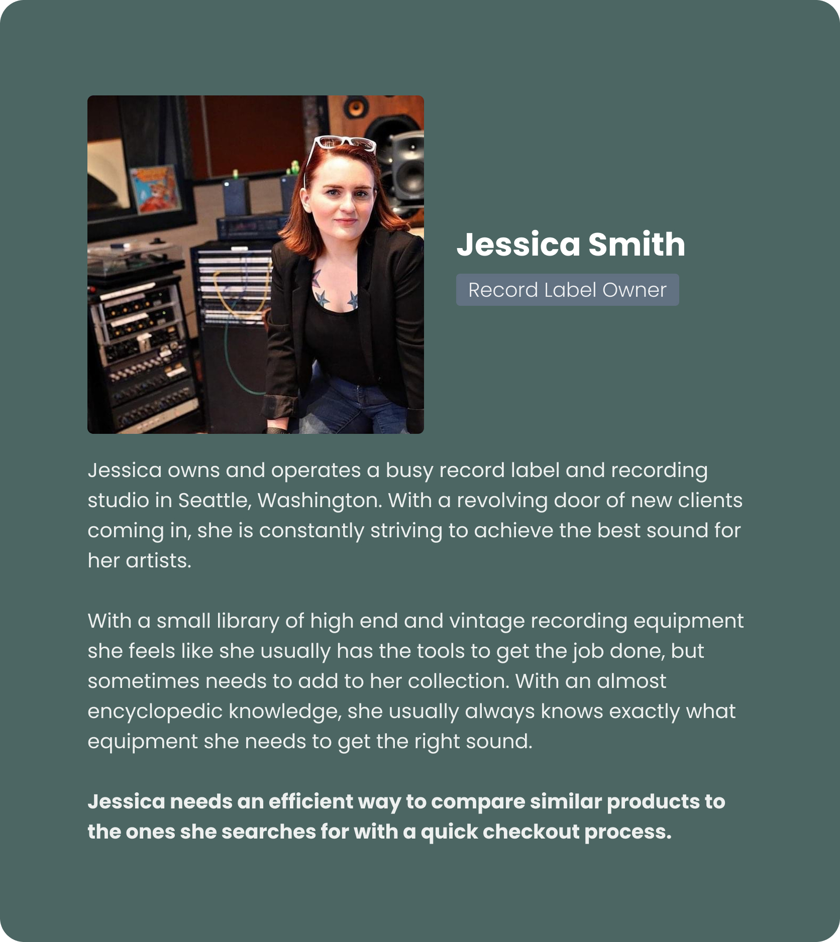
I sought to interview local musicians who made boutique instrument purchases occasionally as well as recording studio owners who were browsing and purchasing much more frequently.
“When product information is incomplete or inaccurate, it’s hard for me to know if I’m even getting the right item.”
- a local musician

Users want to be able to find what they need without endlessly scrolling through a list of products.
Users want complete product information so they can feel informed on their purchases.

Users want to be able to efficiently compare similar products with a fast checkout process.
My goal is to create a system that is easy and efficient to use, while providing the most detailed view of a product possible. This combined with a quick checkout process will leave users feeling like they made the right choice. Using the data I collected, I began to define who the target audience really is.
While I was able to identify a number of trends a few stood out to me in particular. A majority of users
stated that they had frustrations with a lack of product information and pricing, but most other platforms
had the same issue. In a similar note, a number of users stated that they wished there were more high
quality images of equipment listings, especially for used products. Users also stated that they wanted
simple navigation with sales and deals being one of the first things they see when visiting the website.
By incorporating a highly detailed product listing page that requires the fewest amount of clicks possible,
we can ensure that users will find the items they want and feel informed on the purchases they plan to make.
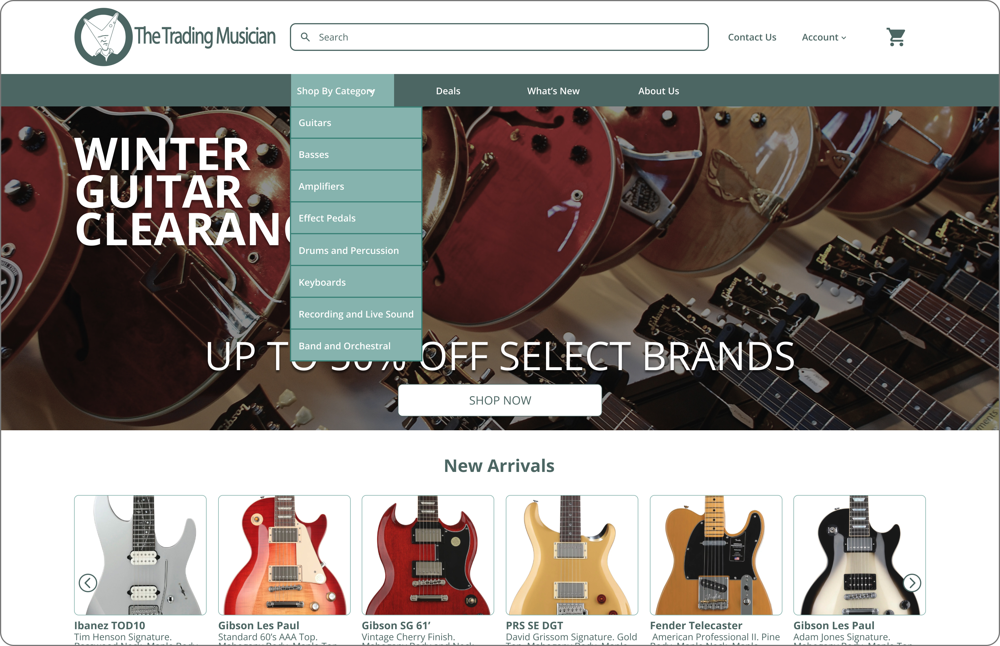
By nesting sub-categories into a drop down menu, we can reduce the menu options initially given to users to make the navigation feel less overwhelming.
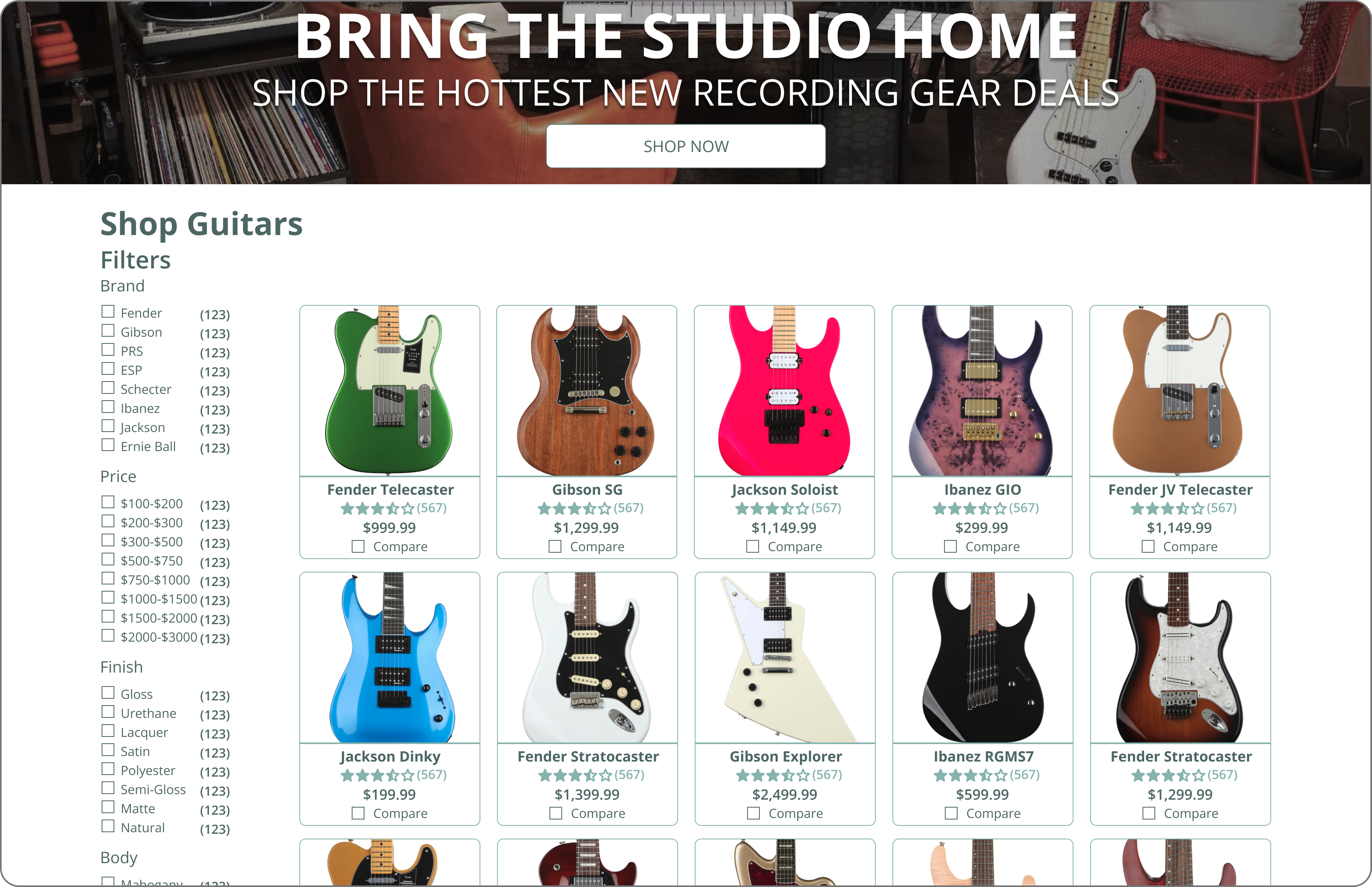
Adding a comprehensive filtering menu helps narrow down the listings presented to a user so they can find what they are looking for easily.

Adding a list of highlighted features to the product listing page with reviews, visible pricing and wishlisting options provides users with a clearer picture of what they’re planning to purchase.
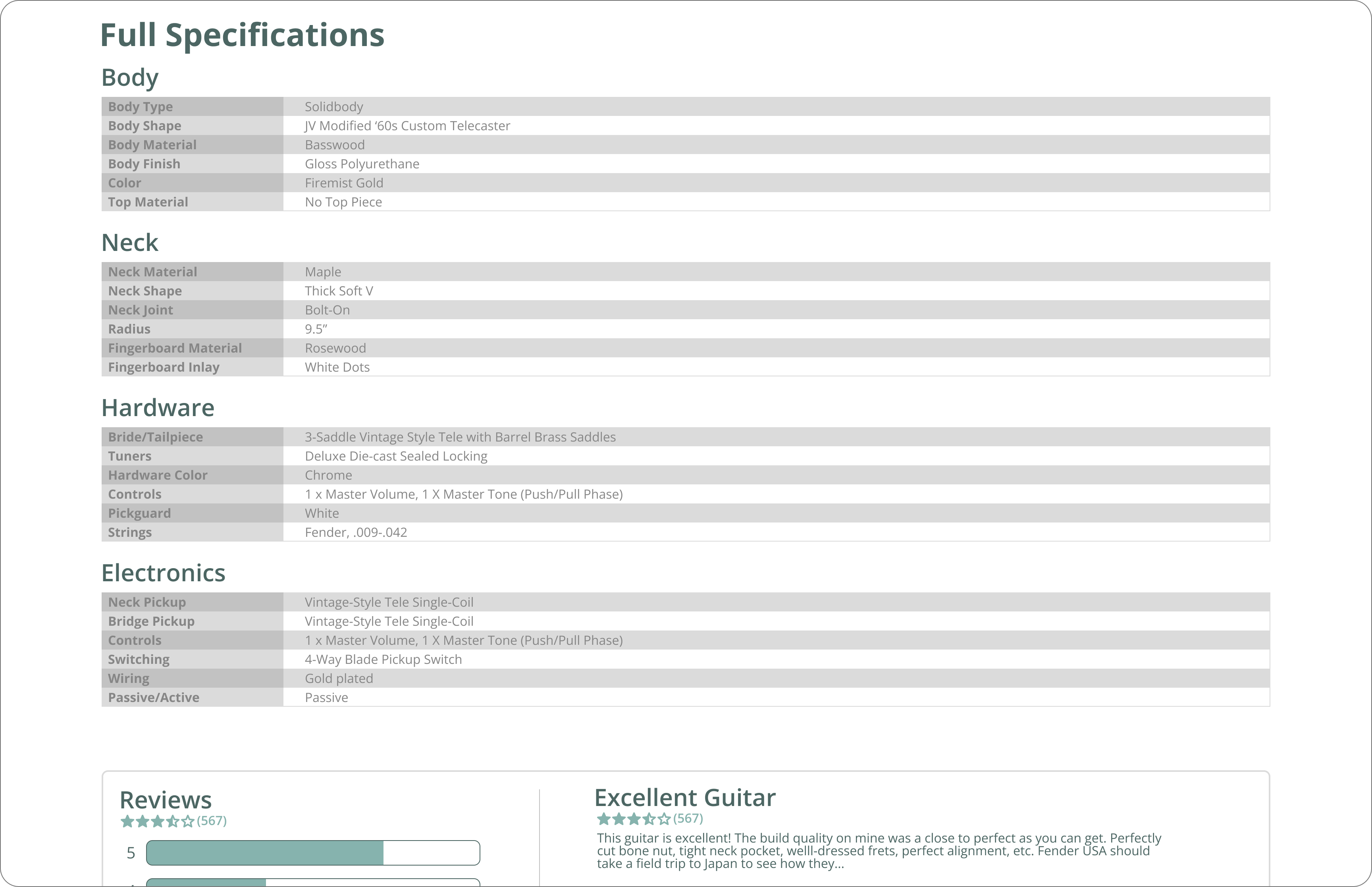
A highly detailed specification sheet provides users a more in depth view of a product with an expanded reviews section below.
A majority of users particularly liked the product comparison tools of a few other popular music equipment
retailers, stating that when it comes to high value purchases they like to be able to quickly compare the
listings they view to other similar items. A number of them had resigned to pulling up product
specifications on multiple websites at once to compare, feeling that this was a hassle.
By creating a quick and easy product comparison feature that is accessible directly from the product listing
page, we can give users the ability to compare two items without having to navigate further into the
platform.

Incorporating a “Compare” checkbox allows users to select two items they wish to compare specifications for directly from the product listing page.

An overlay showing the users selected items allows them to confirm their choices before navigating away from the product listing page.
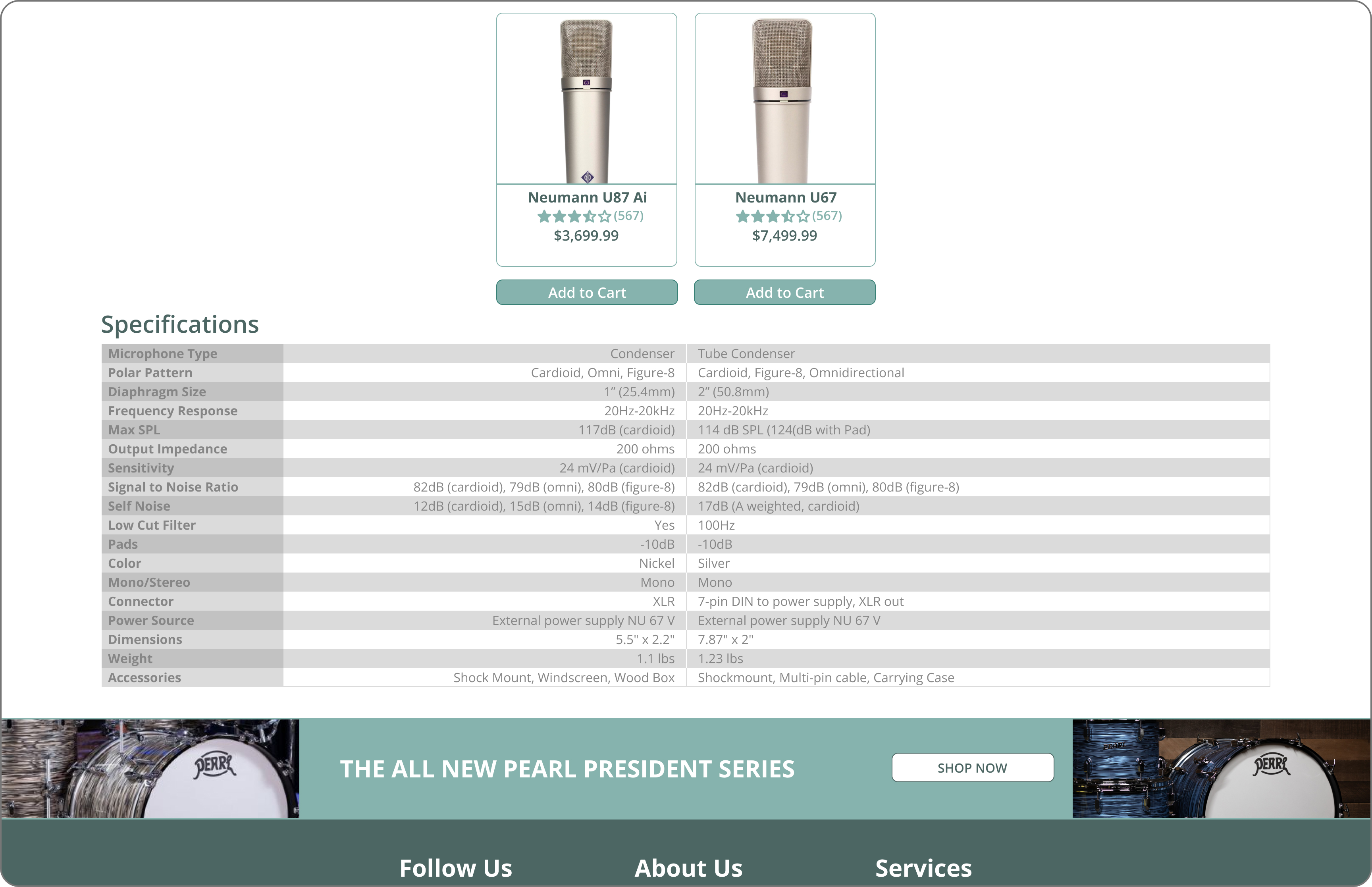
A complete layout of product specifications for the user’s selected items allows the user to compare similar products in depth before making a purchase.
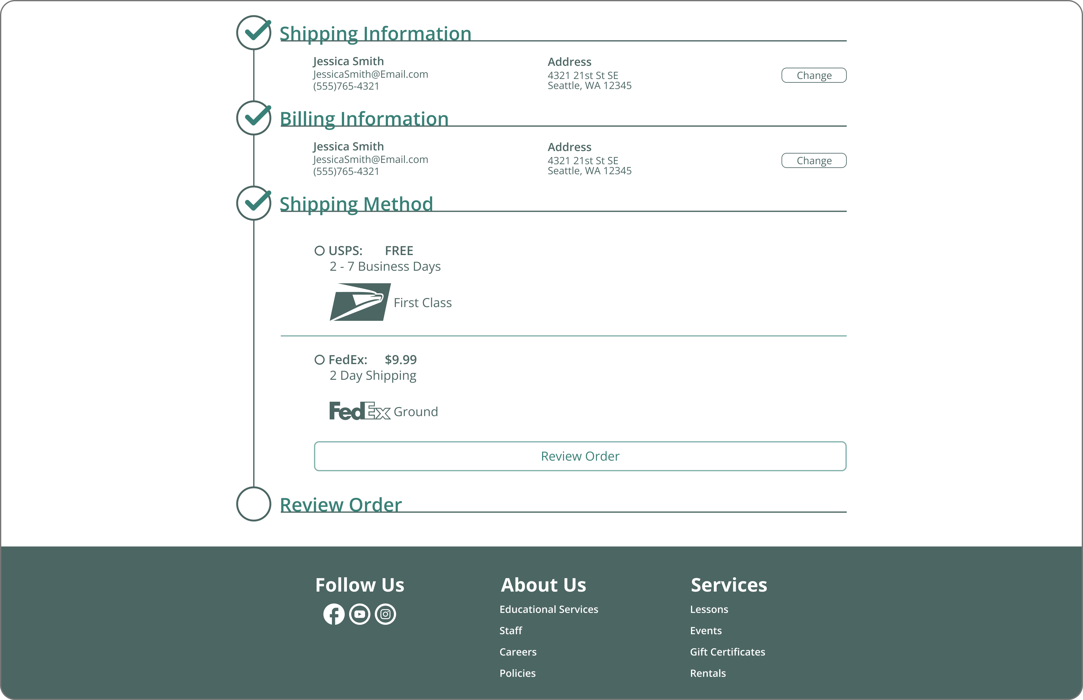
Allowing the user to create an account and save checkout information for future purchases streamlines the checkout flow and makes purchasing for repeat customers quick and easy.
Every feature is designed to allow the user to find what they want and make an informed decision with the fewest amount of clicks possible.
Usability testing included 5 moderated tests with users, 3 of which were initial interviewees. While 100% of users stated that they liked being able to find the item they were looking for with only a few clicks, more users were confused on how the product comparison tool worked. This was noted in the fact that users could not locate the “Compare” checkboxes on the product listing cards. Overall, user feedback suggested an improvement to navigation, product information and checkout flow, however, they also wanted to be able to compare more than two products at once.
I believe that the most important next step would be to redesign how the product comparison tool works. This could mean simply making it more visible and easily accessible or exploring other alternative design solutions based on further research.