
With the rise of event ticketing corporations such as Ticketmaster
and AXS, the control over event ticketing and promotion has been
removed from the average organizer. The monopoly that is Ticketmaster
even controls over 70% of the market for live event ticketing, buying out
every bit of competition in the way. This has resulted in a number of
issues for the everyday user. From rampant unexplainable service fees,
unfortunate customer service experiences and lack of general event
information, the sense of community and trust in live event ticketing
experiences has suffered immensely.
In order to help facilitate a platform in which organizers, venues and
artists alike can build community and trust with patrons of the arts, my
team and I have designed a live event ticketing application centered
around social connection and honesty. This included not only a place
for users to purchase event tickets, but a place to participate within the
community as well, allowing for a more immersive experience with the arts.
Working in a team of three with my partners Taylor Woo and Danny Tran, my role consisted primarily of UX Research, Wireframing, Usability Testing and Branding.
2-Week Design Sprint
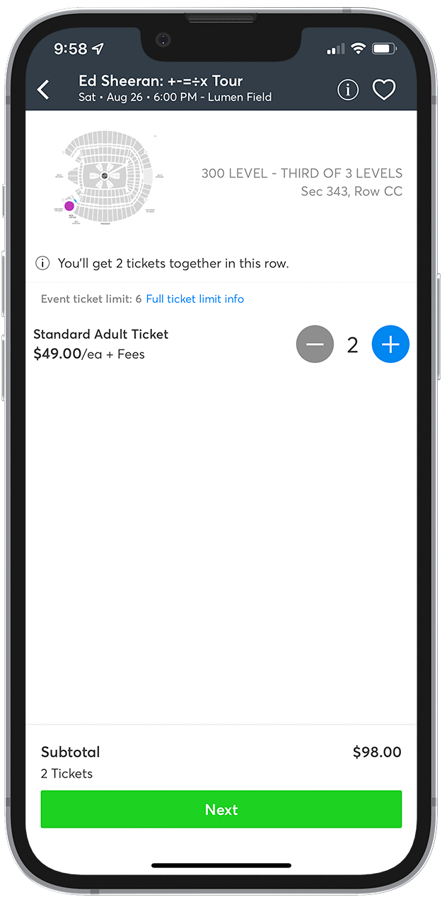
At the moment, Ticketmaster’s platform provides an experience that feels entirely
transactional. Viewing an event page immediately displays the available seating and ticket pricing per
seat, giving the user no real information on what the event actually is.
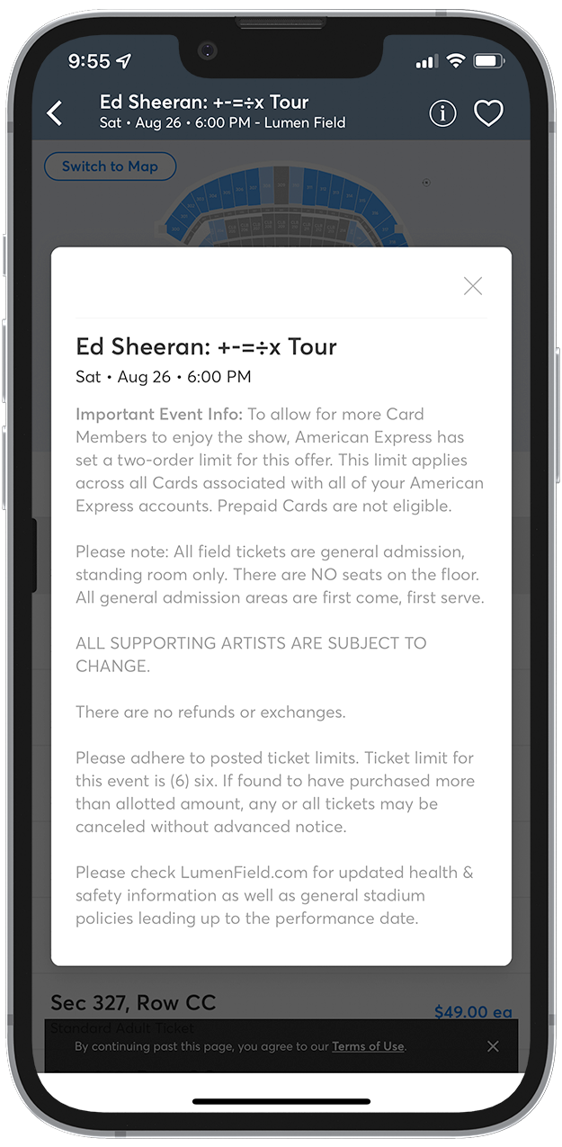
Only once you have clicked on the information icon at the top right of the screen can you see the event
details and upon viewing an overlay, it reads more like a terms of service than an exciting event
description.

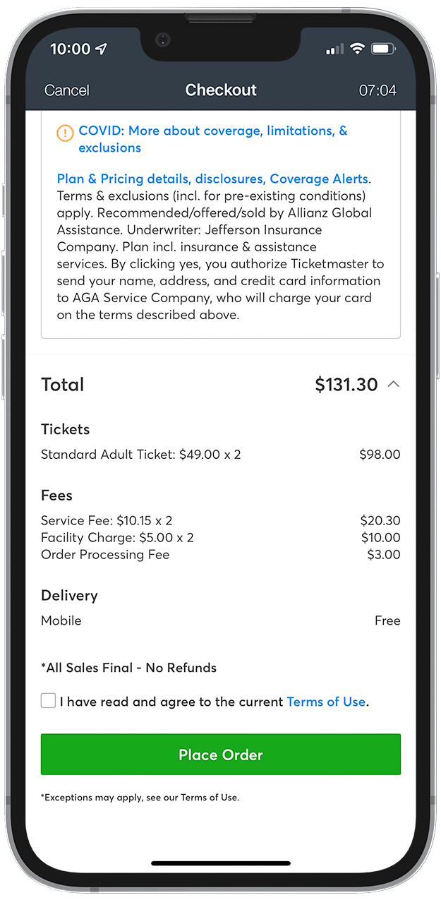
Furthermore, upon deciding to purchase tickets to an event, you select a ticket and
seat before checkout. While this is seemingly innocuous, you are unable to see what extra service fees
are attached until you are about to place your order, and even then you can’t actually see them unless
you open an expanded menu.
This provides an experience that feels dishonest and creates a sense of distrust with users, as well as
one that disconnects users from community.
The overall experience of planning an outing for an event with this method leaves a lot to be desired. There
is no center on community and personalization to the individual user and it lacks any user connection to the
artists and organizers at large.
This is a problem we can convert into a solution. If we want to connect more people to the arts community,
we need to facilitate community building while still meeting the needs of an e-commerce platform.
How do we do this? We ask the users directly.
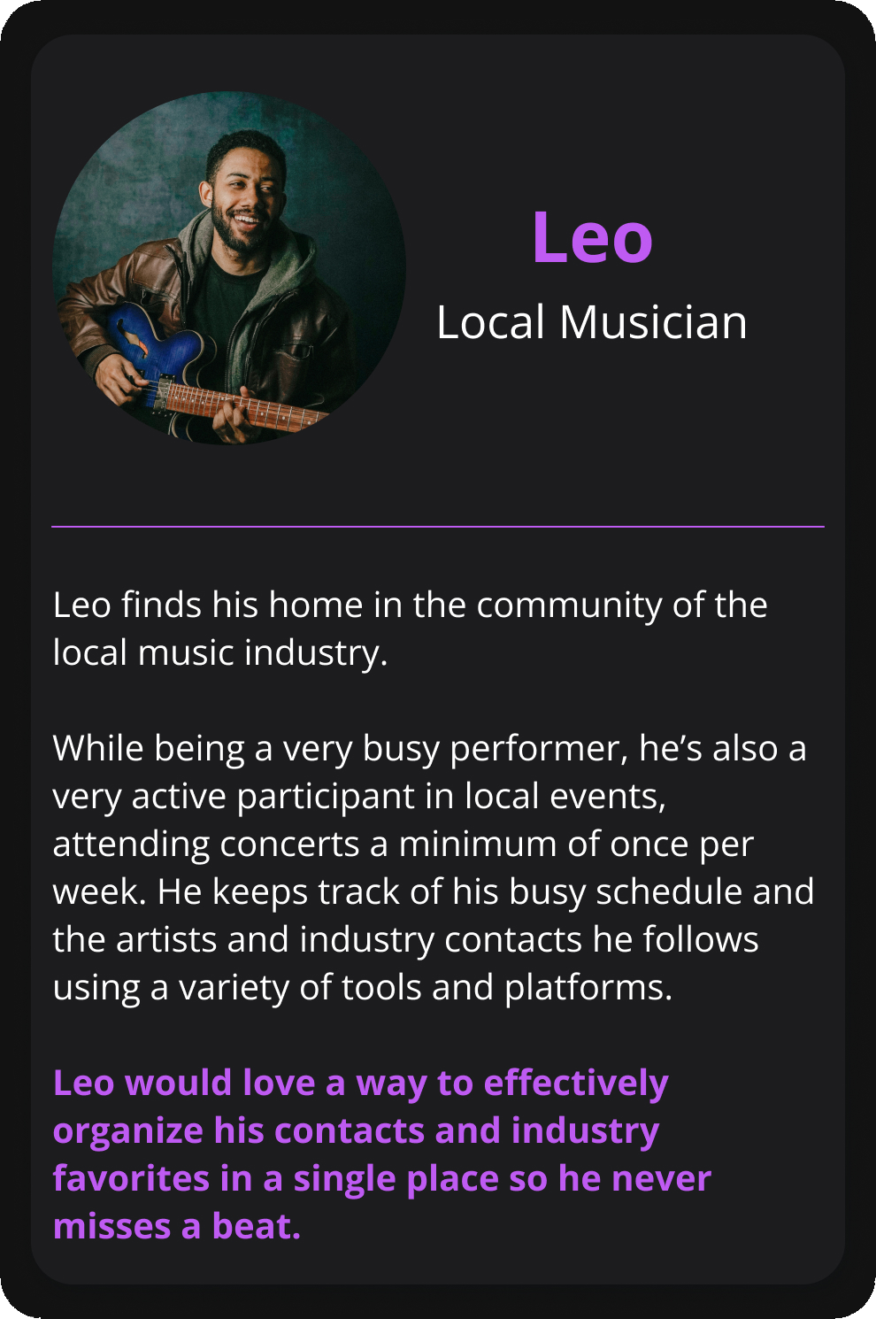
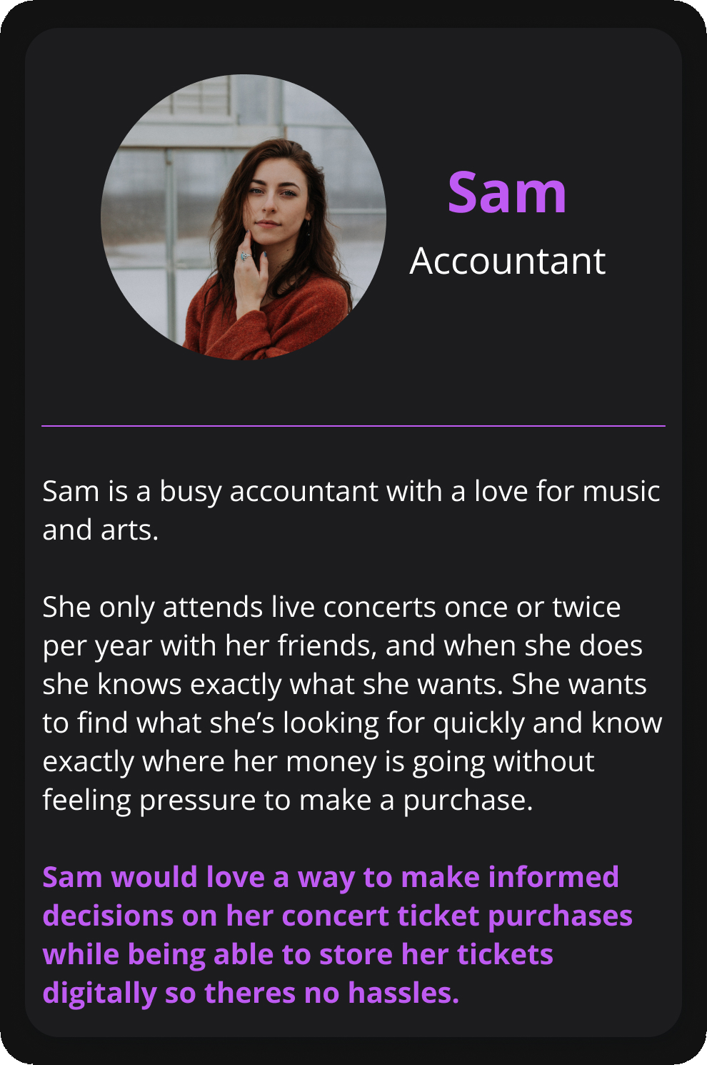
The core motivations of users we desired information from were the focus of our initial thoughts on this project. We wanted to discover what made people enjoy this experience and what frustrated them most in their interactions. This included users who only purchased event tickets once or twice per year, to local musicians who attended events weekly while also organizing their own events.
Who are the people most likely to interact with a local arts community?
Why do people enjoy their experience interacting with it?
What makes them feel like a part of a community without being taken advantage of?
How can people meaningfully connect with a local arts community wile feeling like they're supporting a local business?
We sought to interview people who attended events infrequently as well as musicians and event organizers who were engaged in participating in a local arts community regularly.
“I prefer to browse upcoming events on local venue websites and I prefer
to contact them for my event
organization directly through email.”
- a local musician

Users want to know who they’re following and who they’re performing with.
People want to know how much they’re paying up front. Not an estimate of the overall cost.

Users want an experience that is easy to navigate with all of the relevant information.
Our goal is to create an honest and open ticket selling process with an emphasis on creating connections around a local art, performance and event organizer community. Instead of getting people to checkout as fast as possible, we’re connecting them to what’s happening around them and inviting them to immerse themselves in it.
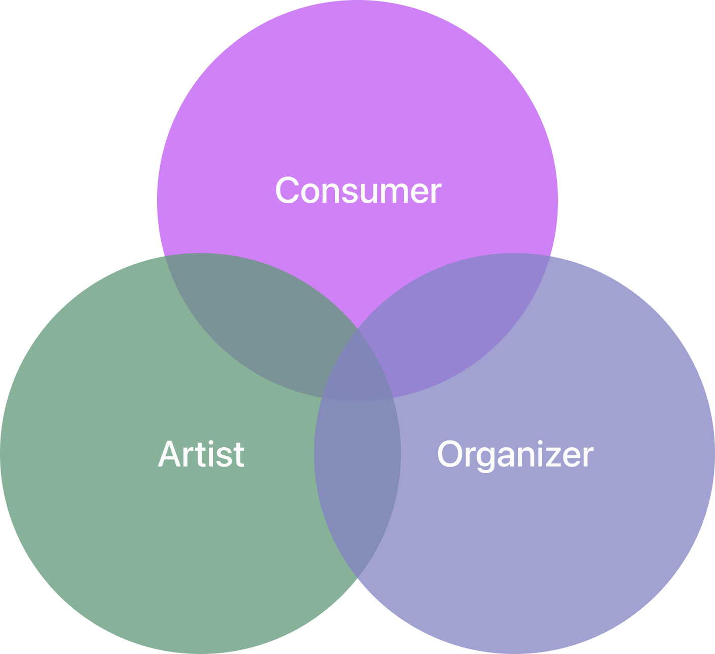
My team and I began to identify key features required to make our app function on a basic level, followed by features that would improve the experience of our target audience.
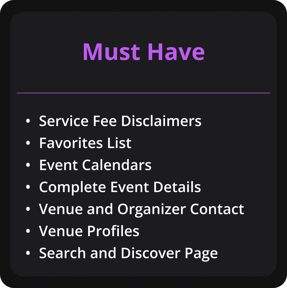

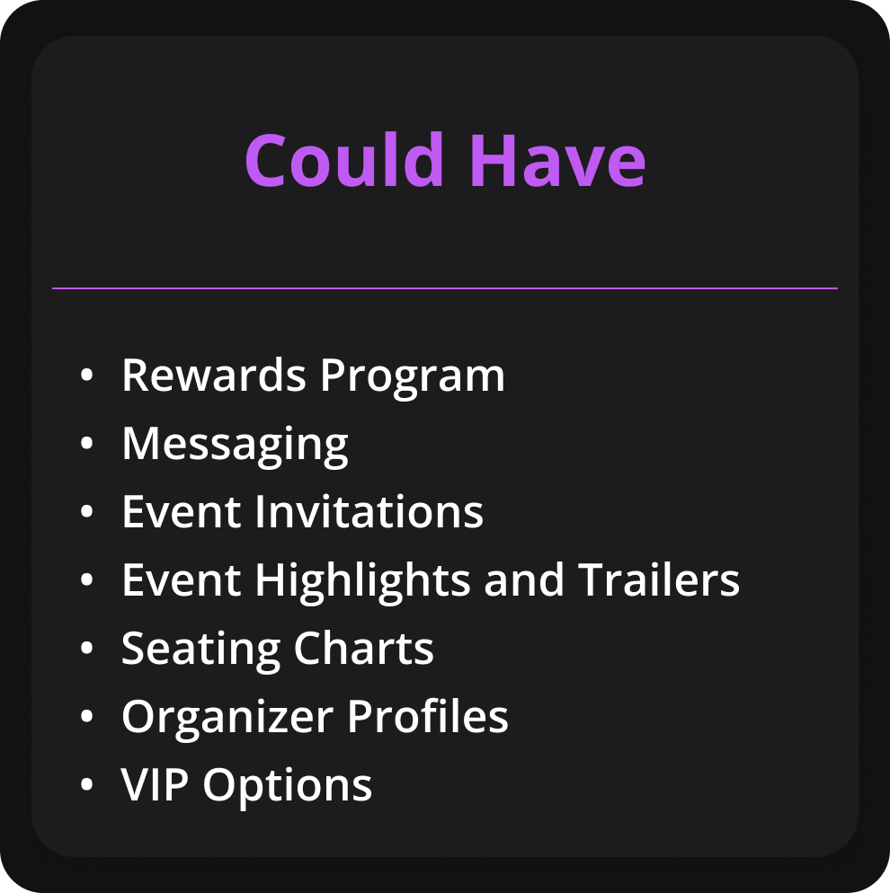
With the features we needed to include identified, we took a retrospective look at our target audience’s
experience using popular apps such as Ticketmaster. This was ultimately helpful in finding key pain points
in the experience of purchasing online tickets as well as interacting with a local arts community
online.
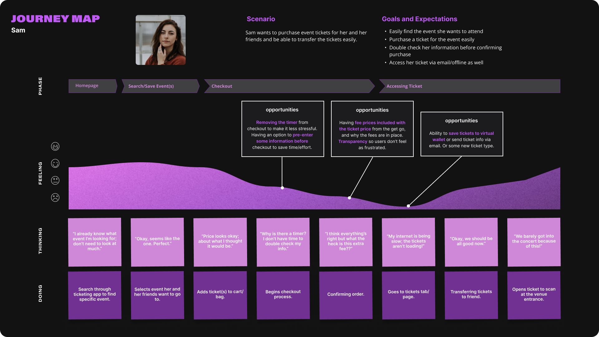
While Sam is relatively happy with the convenience of finding events she’s interested in, it becomes a
frustrating experience for her when she encounters unexplained service fees and is pressured to make a
purchase quickly without all of the details.
Leo’s experience in finding events, venues and artists he really likes is a relatively painless one for him, however he is frustrated that he has to visit multiple platforms and websites to get the full picture as well as finding contact information for venues and organizers he wishes to book his band with.
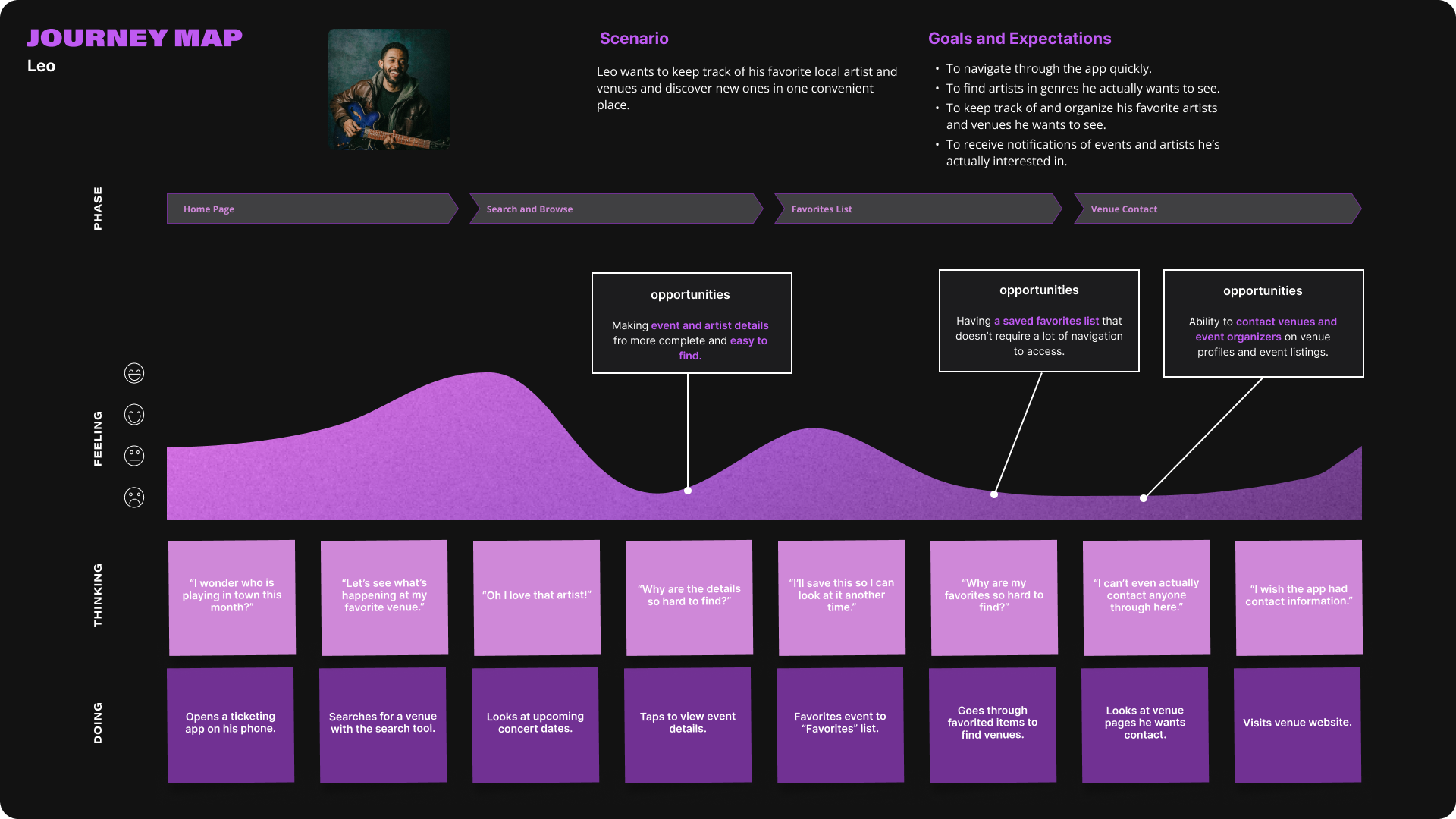
These maps helped us to identify key opportunities to make our target audience’s experience a pleasurable and convenient one as well as the specific steps they would take in completing tasks using our app.

The monopolization of event ticketing platforms has created a volatile environment for the average consumer
to be informed on their ticket purchases. Rampant service fees and lack of event information leave users
desiring a better experience.
By adding full event details, a service fee disclaimer, and functionality to digitally store and transfer
tickets, users can put trust in their purchases and enjoy live events with friends while feeling at ease.
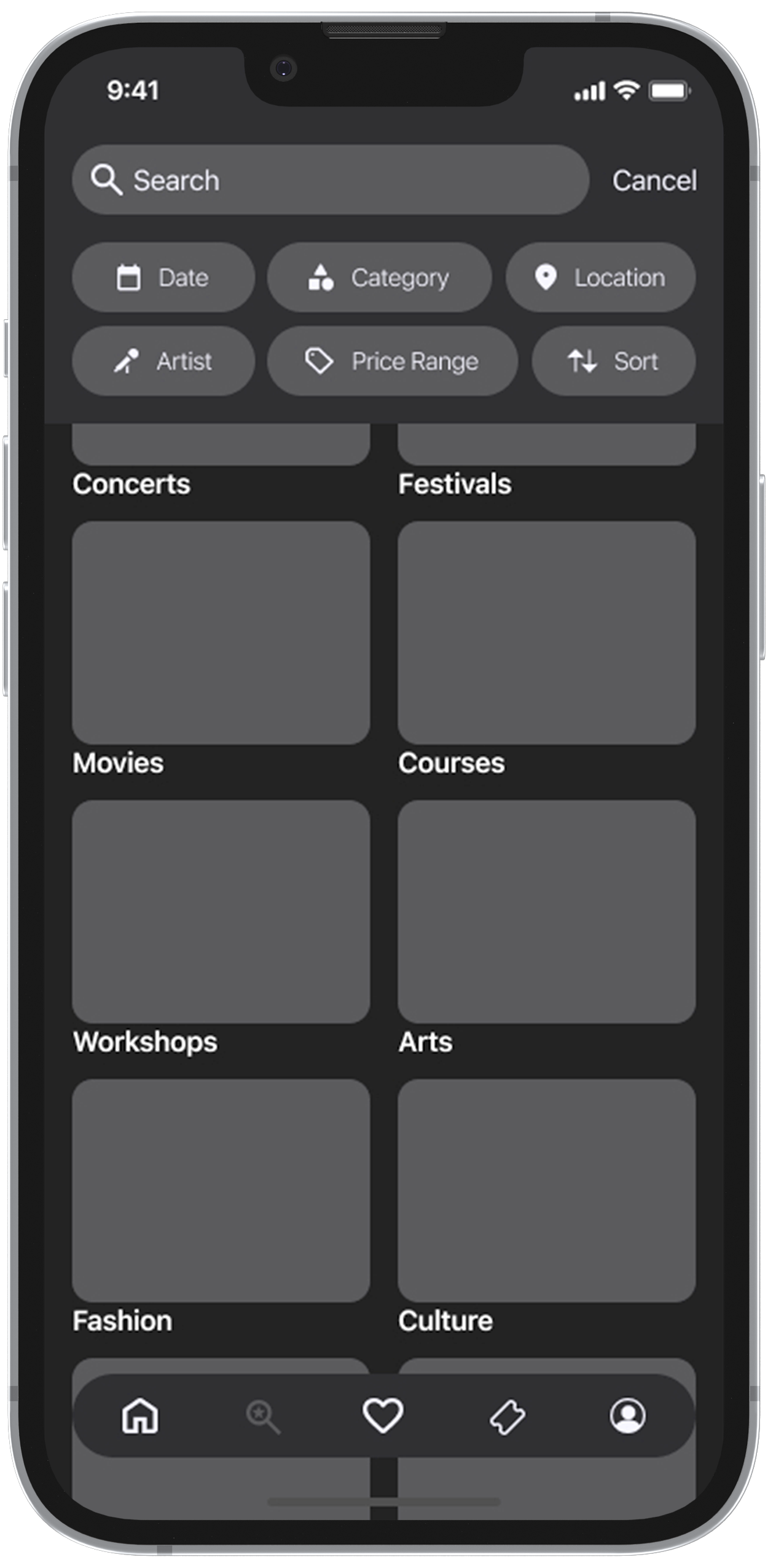
A comprehensive search function with filters to find exactly what users are looking for.
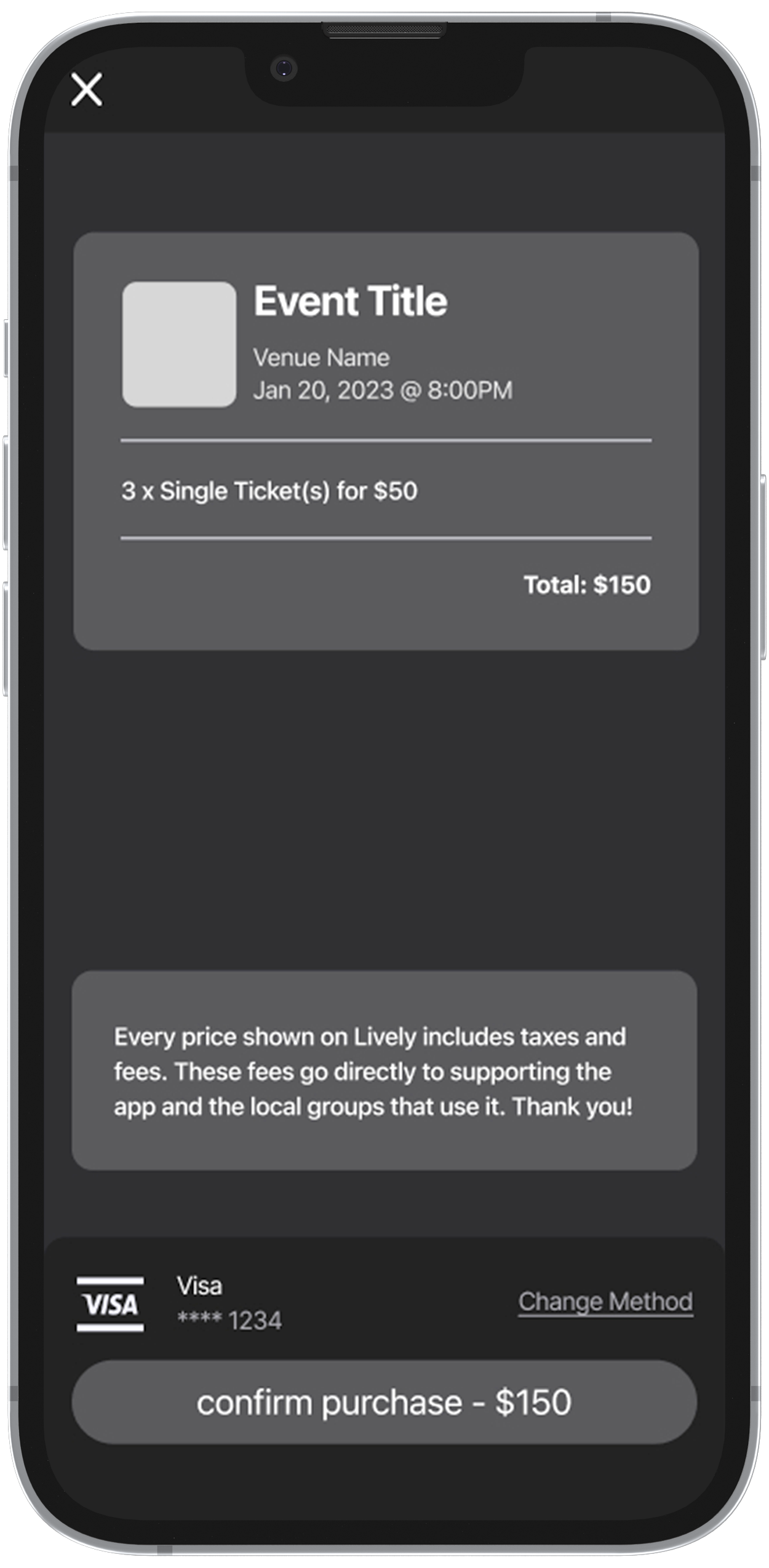
Checkout pages with service fee disclaimers so the user gets the full picture.
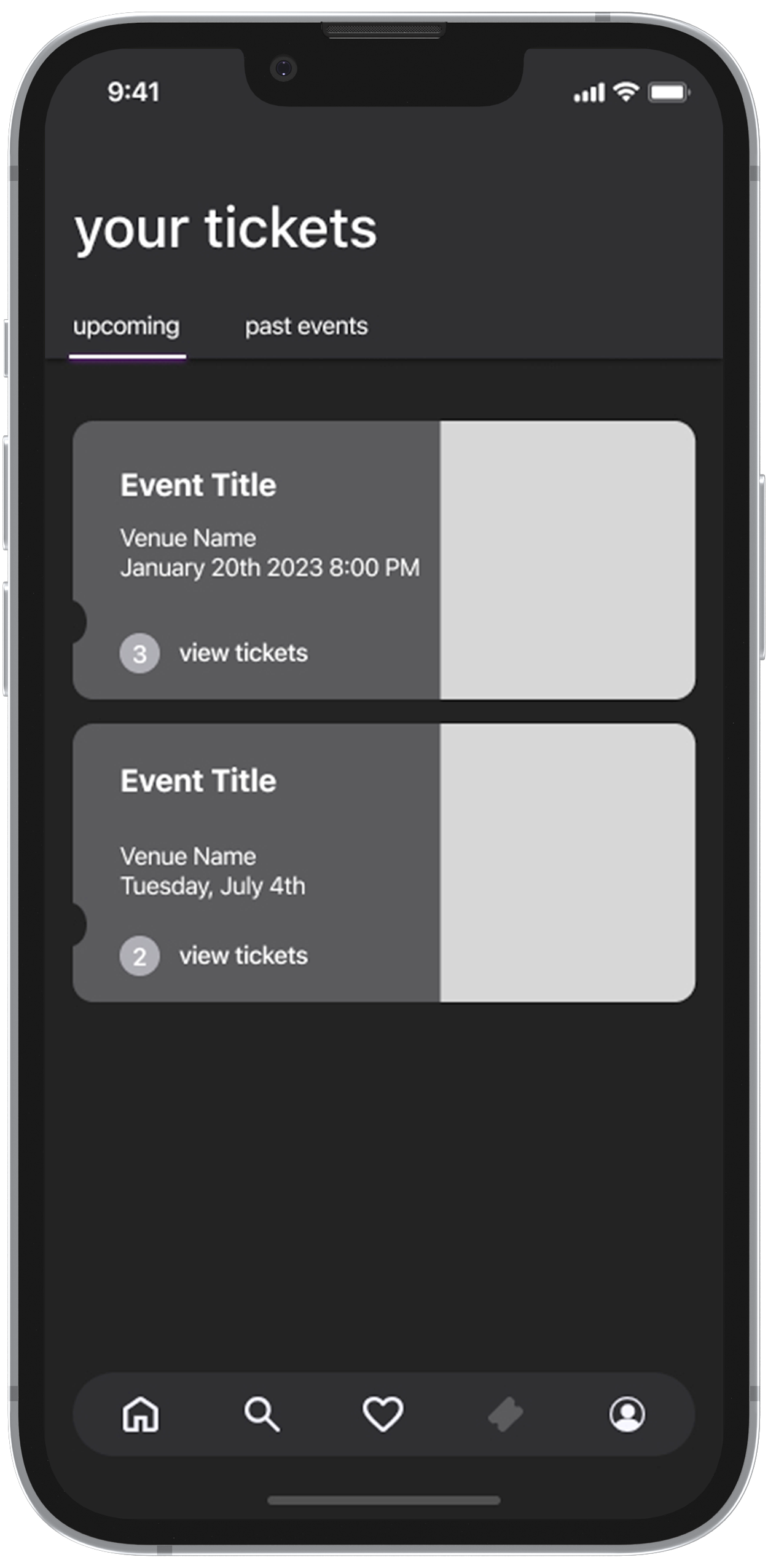
Easy access to view upcoming and past event ticket purchases.
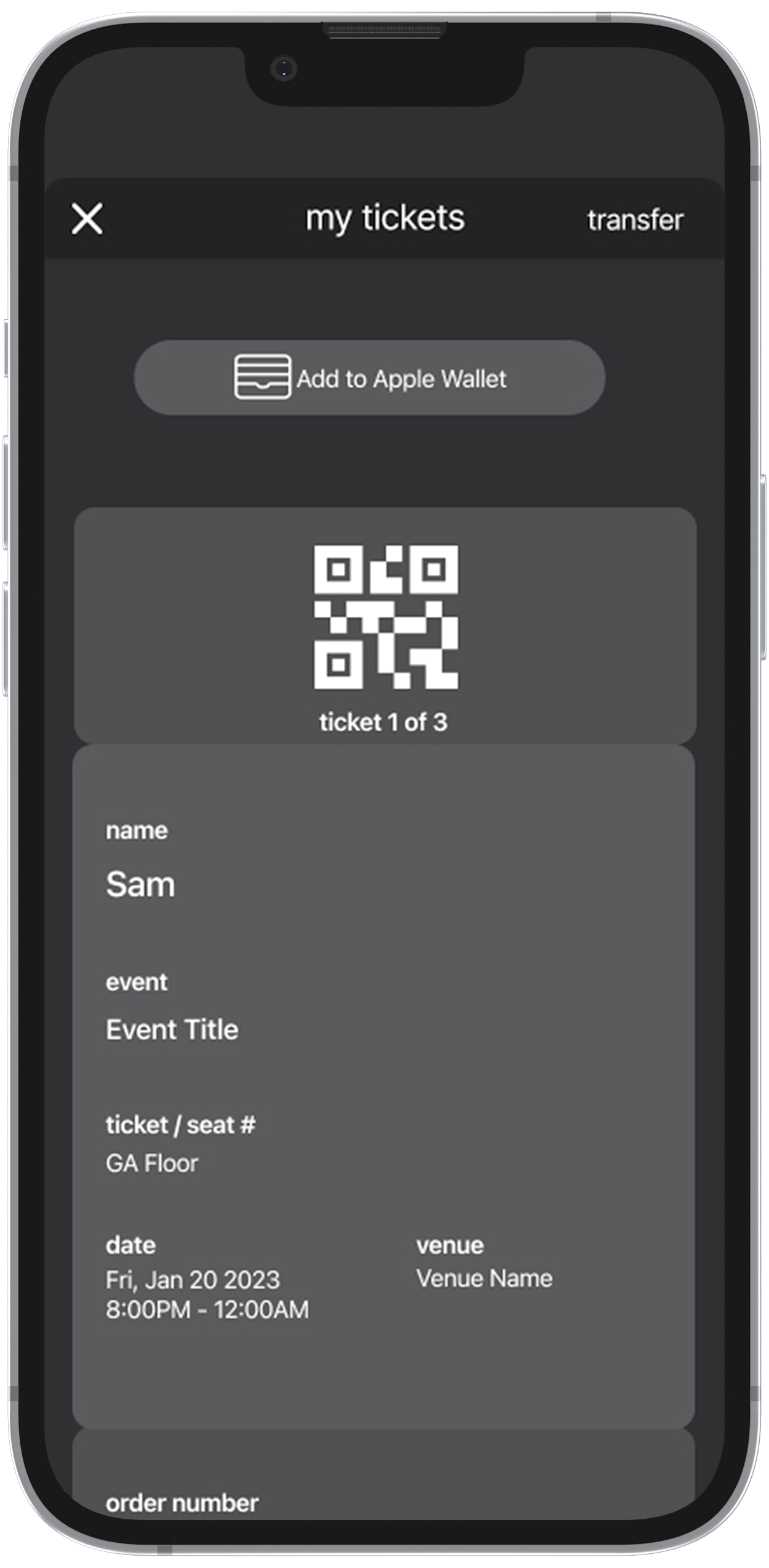
Digital ticket storage, making purchased tickets available anywhere and anytime.


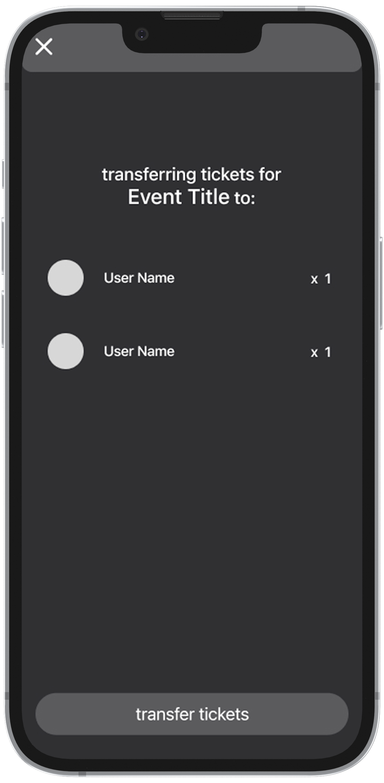
A fast and convenient way to transfer tickets to friends users have added in the app.
With a majority of our user base browsing multiple website’s and platform’s event calendars, it can quickly
become a hefty task for them to keep track of and up to date with their favorites.
By adding the ability to favorite any category in our app, users can quickly and easily access a saved list
of all of their favorite items and receive personalized notifications on upcoming happenings in their area.
They can also revisit any previously viewed page at any time.
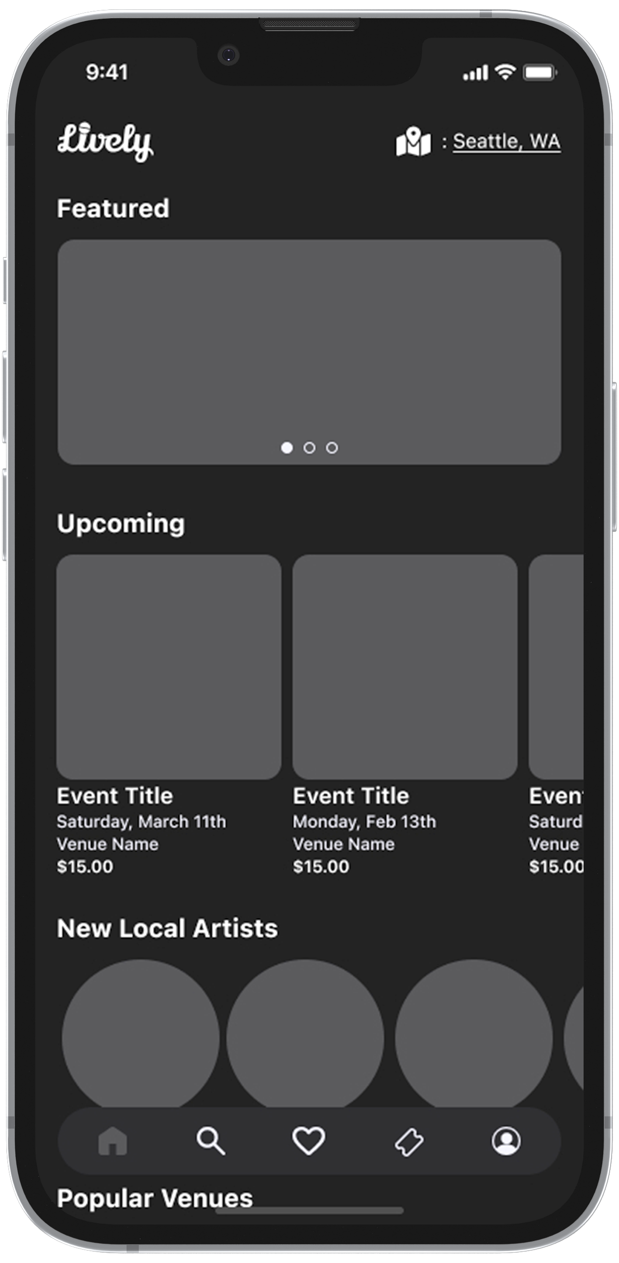
An E-Commerce style home page to encourage discovery of new artists, venues, and events in the local area.

Venue profile pages filled with all of the relevant information as well as direct contact options for artists.

An event listing page with links to artists profiles and organizer contact information.
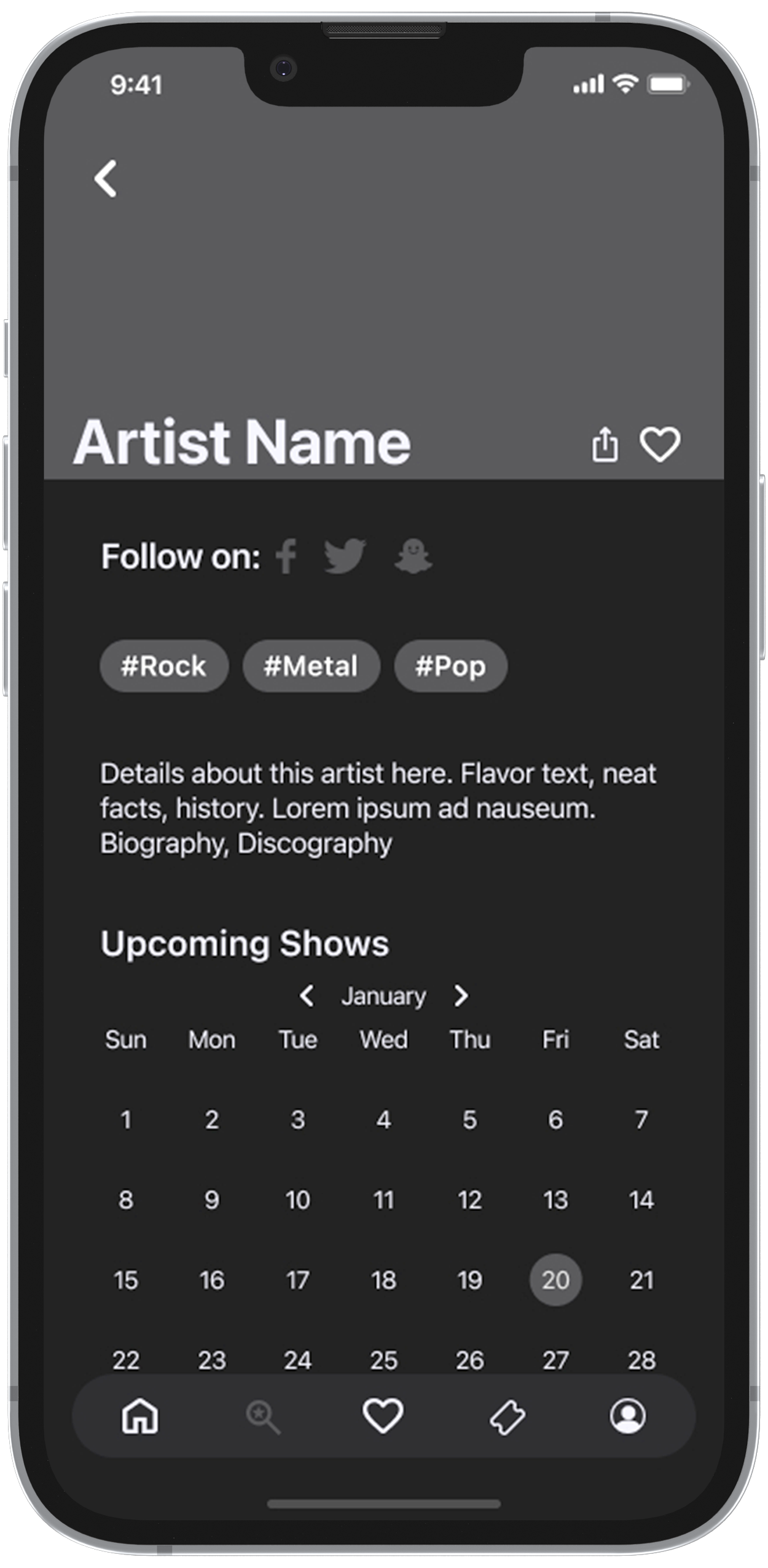
Artist profile pages with genre tags and a complete calendar of all of their upcoming events.

The users favorites list allows them to curate and keep track of everything they like while receiving personalized notifications.
All types of profile pages have the added ability to save an item to the users favorites list so they can reference them at any time.
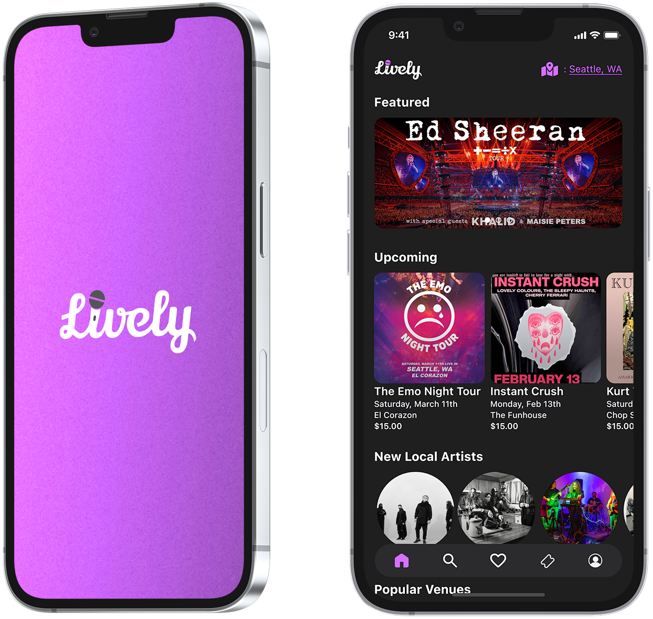
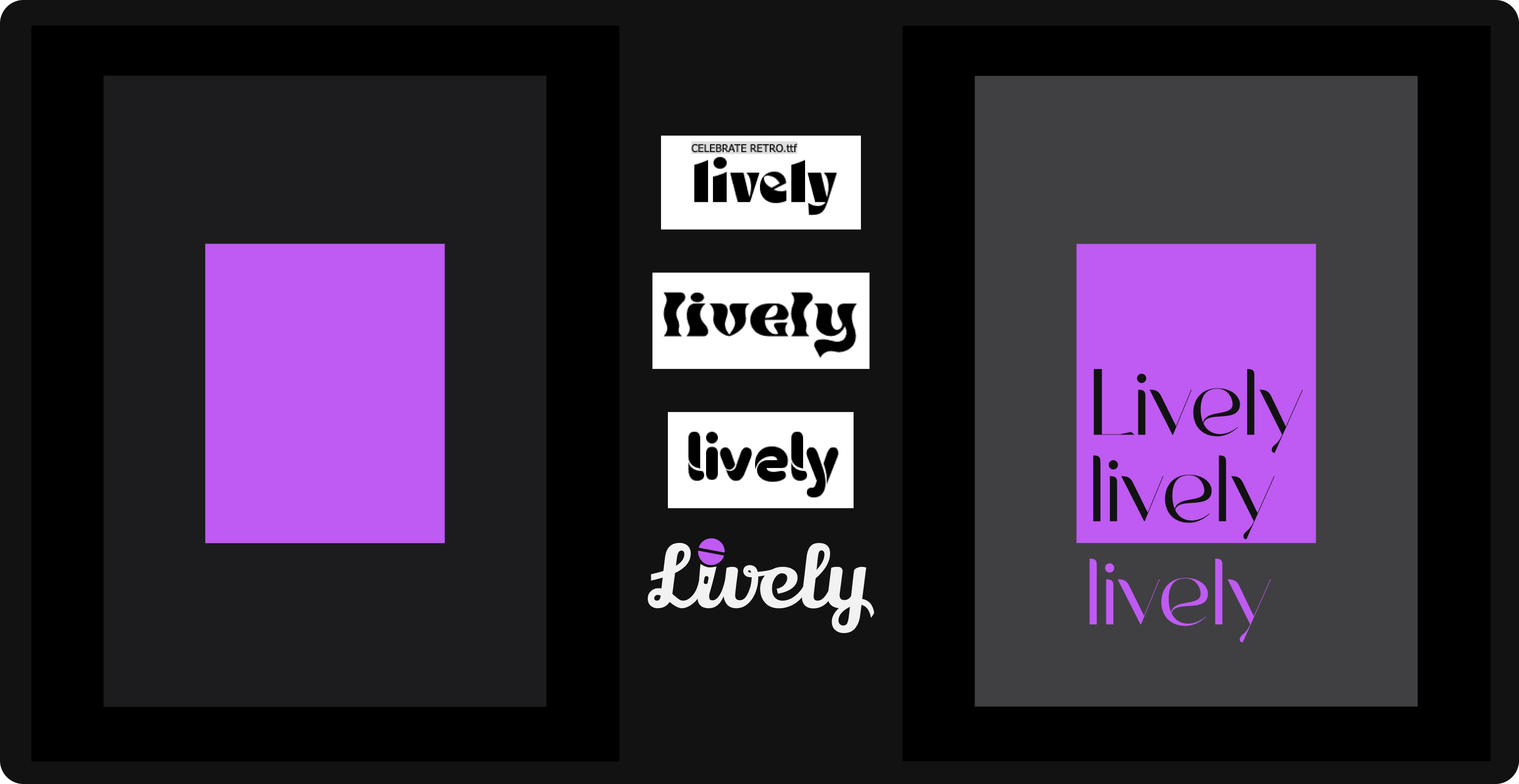
Our branding ideation initially focused on a name. After deliberating a short list of options we landed on
the name “Lively”. Experimenting with a number of different typefaces, we landed on a script style to mimic
a microphone cable with the “i” being replaced by a microphone.
Upon searching for design inspiration, we noticed that many popular event ticketing platforms and music
streaming services utilized a dark theme. We chose to use this as it encapsulated the feeling of nightlife
with opting for a bright purple color as a main call to action.
Over a series of 8 usability tests, we gave users a set of four tasks to complete with our prototype. While taking observation of their behaviors when interacting with our app, we then asked them a series of questions about their experience. The results of these tests helped us to make a few iterations on our initial designs.
The addition of a back button and changing the “Write a Review” link to a button.

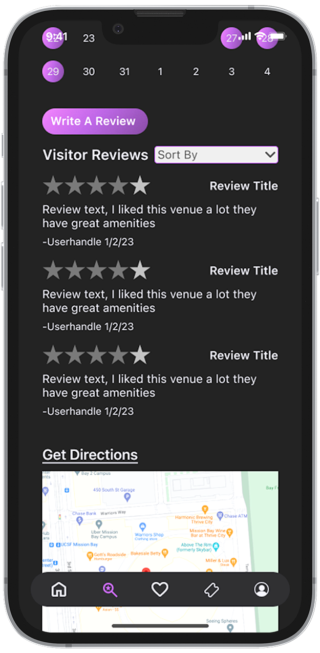
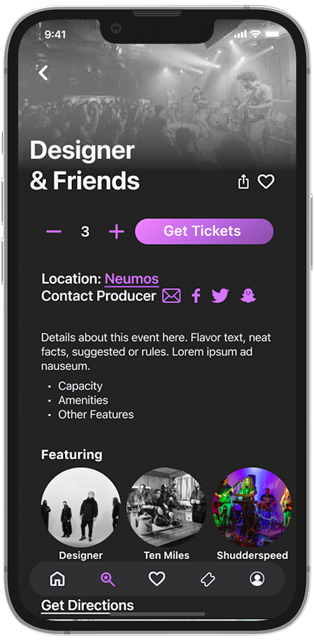

The addition of a back button and changing the “Write a Review” link to a button.